Development Team: Easy Class
Evaluating Team: Slack
For the heuristic evaluation, the Easy Class team instructed that we deliver a list of problems that we discovered and link these issues the usability principles highlighted by Easy Class.
List of principles provided by Easy Class:
1. This system keeps me oriented.
Justification: As our application involving switching between different interfaces for various functionalities, our design would fail completely if users fail to complete their tasks because they get lost during these switchings.
-"Visibility of system status (responsiveness)
The system should always keep users informed about what is going on, through appropriate feedback within reasonable time."
2. I can draw on real-life experiences to interact with this system.
Justification: For our application, we aim to provide a generally acceptable and understandable system design to users so they work with our system efficiently, and the most familiar things to them are undoubtedly their life experiences.
-"Match between system and the real world
The system should speak the users' language, with words, phrases and concepts familiar to the user, rather than system-oriented terms. Follow real-world conventions, making information appear in a natural and logical order."
3. I feel in control working with this system.
Justification: Since our main user population is students, we definitely need to grant them freedom so they won't dislike our application because they feel constrained.
-"User control and freedom
Users often choose system functions by mistake and will need a clearly marked "emergency exit" to leave the unwanted state without having to go through an extended dialogue. Support undo and redo."
4. This system is easy to understand for its consistency.
Justification: Again, we aim to provide a generally acceptable and understandable system design to users to help them work efficiently, and consistency is obviously conducive to that.
-"Consistency and standards
Users should not have to wonder whether different words, situations, or actions mean the same thing. Follow platform conventions."
5. This system prevent my errors.
Justification: Every human-being makes errors. Since our main users are students characterized by emotionality, our design should help them avoid errors so they won't get frustrated with our system and leave off using it.
-"Error prevention
Even better than good error messages is a careful design which prevents a problem from occurring in the first place. Either eliminate error-prone conditions or check for them and present users with a confirmation option before they commit to the action."
6. This system looks agreeable by its simple design.
Justification: First we ought to ensure our design conforms to general aesthetic rules so it looks attractive to our target population, and also because it's an in-class application, our design should be simple and not distract students from class.
-"Aesthetic and minimalist design
Dialogues should not contain information which is irrelevant or rarely needed. Every extra unit of information in a dialogue competes with the relevant units of information and diminishes their relative visibility."
7. I get helps from the system on how to use it.
Justification: Every experienced user starts as a novice. Again, Since our main users are students characterized by emotionality, our design shouldn't frustrate them when they couldn't a specific feature of our system and leave off using it. What we should do is providing helps for them.
-"Help and documentation
Even though it is better if the system can be used without documentation, it may be necessary to provide help and documentation. Any such information should be easy to search, focused on the user's task, list concrete steps to be carried out, and not be too large."
Additional Principle written by the evaluation team:
8. The purpose of the system is clear to the user
Justification: One of the features the distinguishes the Easy Class Application from mycourse's is the functionality to upvote questions so that they are of more of importance for the professor and other students to answer.
We noted that all of the usability problems observed by members of the evaluation team were also discovered by the users during the user tests except for #2 (Able to login with false credentials).
These are the main problems we encountered during the heuristic evaluation:
1. Blue wrench bar showing up after log in.
Please see Figure 6 for an explanation of this problem. While the problem can be resolved in the next prototype, the circular blue wrench showing up unexpectedly in the middle of the screen violates principle number 3 "I feel in control working with this system". Since the system is acting erratically, as a team, we agree that this is a problem worth investing time in exploring potential solutions.
2. Able to login with false credentials (without creating an account).
The user does not have to create an account to log in. To subscribe the user to the correct class, the login information must be linked with the user that is logged in. We classified this problem under principle 1, "The system keeps me oriented", since the user is not yet registered, the following class pages might not correspond to the user's profile, and leave them confused, and potentially accessing another students account. In addition, this is a violation of principle 5, "This system prevent my errors" because there was no warning message when false credentials were provided. Since the prototype is not yet fully interactive, logging in with invalid credentials was not a grave problem, but moving forward, the system should restrict access to registered users.
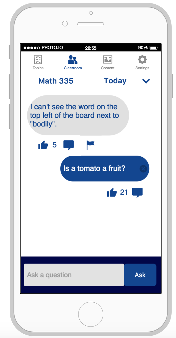
3. Unable to identify the author of the messages in the discussion board.
On the discussion board, the sender of the message is not shown. We thought it important to note that we can't be sure when a professor writes messages on the discussion board or when the professor replies to messages. This problem is a violation of principle 2, "I can draw on real-life experiences to interact with this system" because in typical conversations, a person is usually able to identify the speaker. In addition, omitting names completely from the application creates a form of unfriendly anonymity.
4. Unable to upload files to discussion board.
No "upload file" exists within the discussion board violating principle 3, "I feel in control working with this system". In limiting the discussion board to solely text, users are unable to post meaningful information to share with users. Especially since the application's goal is to relieve the communication burden, we believe supporting file uploading is integral to the application's success in classrooms.
5. The main purposes of are not clearly indicated
The upvoting mechanism could be a greater focus of the discussion page to add emphasis to this function. From the current layout, when a user upvotes a message or a question, there's little indications as to if the priority of the message has changed. Since answering the most upvoted questions is a key part of Easy Class' application, this is a violation of principle 8.
| Observations | Test subject comments | Failure conditions of Usability Goals (UG) or Heuristics (H) |
|---|---|---|
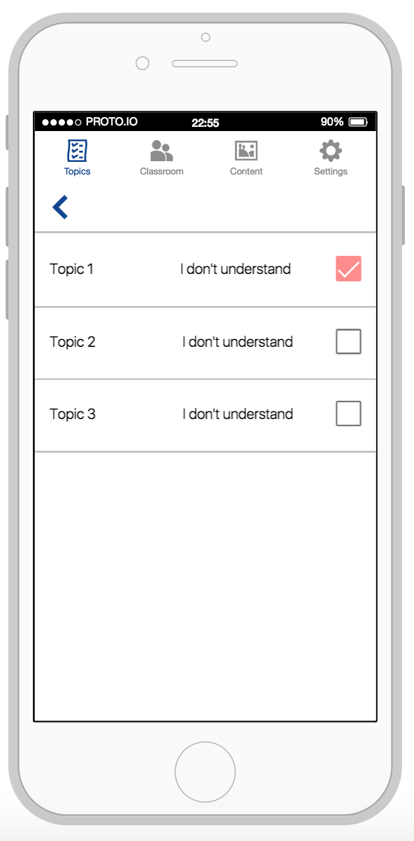
| Users expressed confusion when a course page did not show up after selecting "I don't understand" of one topic (figure 7). | "Why can't I click on this?" "Why isn't it working?" "I want to go in [course subject page, by pressing I don't understand] but I can't!" | UG#2: "the system should be easy to operate": the logical user flaw expected did not show up, causing confusions. H#3: "I feel in control when working with the system": When clicking on "I don't understand", users lost control of the system as they did not navigate to the next page as they thought they would. |
| The instructor encountered a potential design flaw when a blue circle with a wrench showed up after login (figure 6). | "What should I do? I think there is a problem with the system..." | UG#2: the system should be satisfying to operate: visual design flaws frustrate the user when impeding functionality. H#3: "I feel in control when working with the system": the instructor stopped interacting with the system when the design flaw appeared. |
| Users expressed confusion as to who authored the posts in the discussion board (figure 8). | "It feels like only the students are talking to each other, where is the professor?" | H#1: "This system keeps me oriented." The user must know who is sending messages and to whom they are sending messages to in order to properly understand how to use the system. UG#2: the system should be easy to operate: the test subjects appeared lost in certain parts of the application. H#2: "I can draw on real-life experiences to interact with this system": in typical conversations, a person is usually able to identify the speaker. |
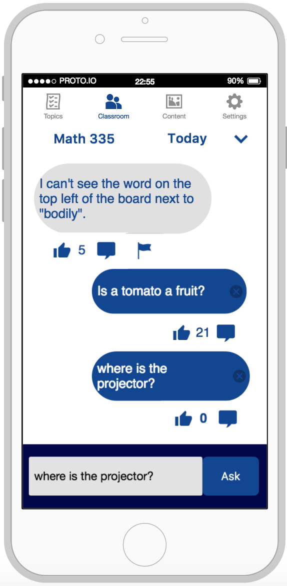
| Users expressed confusion as to who could see the post after the message was sent (figure 9). | "Where does the question go once you've typed it in?" | H#2: "I can draw on real-life experiences to interact with this system": in typical conversations, a person sending a message is usually identified by the participants of the discussion. H#1: "This system keeps me oriented." The user must know to whom they are sending messages to in order to properly understand how to use the system. |
Let the user inspect the prototype on his own to learn about the features and functionalities that the prototype provides and inform the user that he should confirm his readiness when he is done.
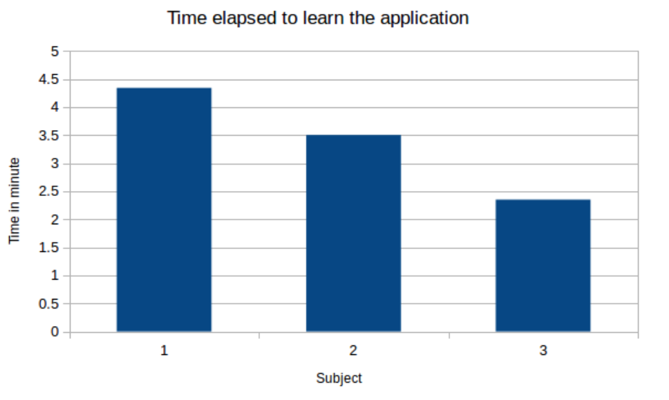
The age of the participant has an influence on how much time the subject needs to learn the application. The instructor has needed more time to learn the application, maybe because the test subject was more focused and wanted to see all the options of the application (this test subject tried the application for a student and for an instructor).
All users:
Strongly disagree 1 2 3 4 5 Strongly agree
H = Discovered in Heuristic Evaluation
U = Discovered in User Test
H/U = Discovered in both User Test and Heuristic Evaluation
| Task | Success of Heuristic Evaluation | Success of User Tests | Comments |
|---|---|---|---|
| Create an account | 5 | 4 | U: One user used their full email as a username. |
| Sign into application | 1 | 5 | H: Able to login with false credentials. |
| Sign out of application | 5 | 5 | No problem navigating to sign out. |
| Navigate to the discussion board of MATH258. | 5 | 5 | No problem navigating to discussion board. |
| Navigate to the discussion board of MATH258, and answer the question that has the most likes in this course. | 3 | 2 | U/H: unclear as to what the upvotes indicate on discussion board. |
| Navigate to the streaming page of the application, and begin to stream the lecture. | 5 | 5 | No problem navigating to streaming. |
| Write a question to the professor of ECSE524 asking the professor to explain "crowdsourcing". | 3 | 3 | H: Little information to help the user navigate (comments not shown, identity of author not shown). U: Confusion over the outcome of the interaction of asking a question. |
| Navigate to the discussion board of COMP252 and indicate the questions of which user is also confused. | 1 | 1 | U/H: Main purpose of the application is not explicitly illustrated, while the upvoting is a main facet, the importance of this feature was not clear to evaluators and users. |
Overall the experiment brought about a lot of useful information and suggestions from the users. With their different backgrounds, chosen based on the testing plan and personas, we were able to get a variety of different suggestions. Also significant is that despite all their differences important cruxes of the system were discovered since they had many similar failings or comments during the testing phase.
Based on our Heuristic Evaluation and the User Tests, we've compiled a List of Usability Issues from most severe to least severe
Over all the user manual was good however we did have a few critiques. First is how the manual was split into Topics, Classroom and Content sections. Within each section there was a separate Instructor Interface and Student Interface part. One section should have been done on the Instructor Interface and one section on Student Interface. We believe it makes more sense that the person reading the document, either a student or an instructor, should not have to read both but only the pertinent information.
Secondly, in the User Manual when walking the user through steps, there are numbers like (1), (2) or (3) embedded in the text. However, there is no information on what these numbers refer to when quoting them. We have inferred that they refer to the images on the same page but there is no label to any of the images so it makes it hard to understand what the number stands for. It may be trivial for the writer but for any person that will read the manual it will not be easy to follow along.
Quantitative measurement: Allow the test users inspect the prototype on they own to get a grasp of the main features of the application before prompting them to perform specific test tasks. Log how long it takes for them to confirm their readiness for following testing. We would expect a maximum of 5 minutes for the users to learn about the main features of the prototype
Instead of leaving the test subject alone to observe the system and play around with it, it would have been better to give some explanation at the test subject before starting the test cases. Indeed, the introduction we were given to say to the test subject was just copy pasted from the Low-fidelity prototype and talking about a paper prototype.
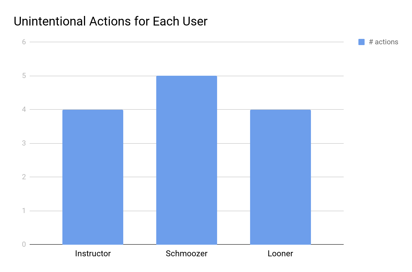
Quantitative measurement: Observe the users as they operate the system and take note of when they unintentionally perform an action. Log all these mistakes. We would expect a test subject to make less than 5 mistakes to meet this usability goal.
The link between "easy to operate" and "unintentionally perform an action" is not straightforward. If the user makes a mistake, it could be because the system is not well-designed or because the user does not understand everything about the system. Moreover, "unintentionally perform an action" is too vague an expression. Quantitative measurements should really be focused and not ambiguous in nature, since it can be hard to determine intention.
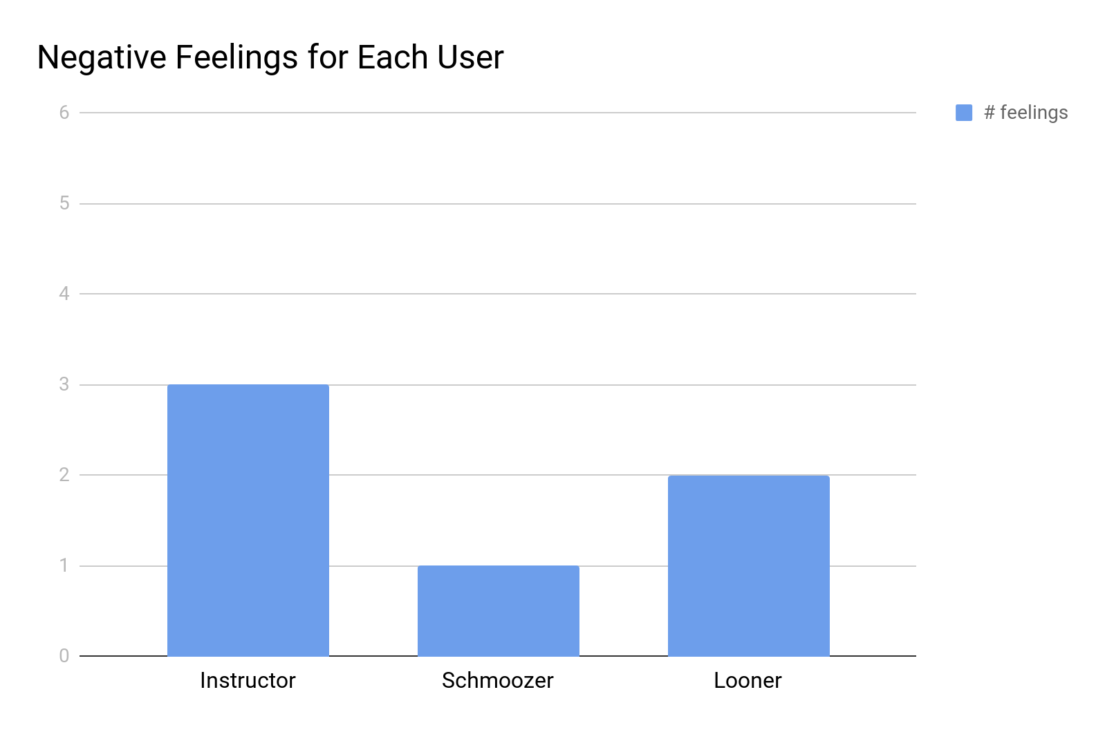
Quantitative measurement: Observe the users as they operate the system and take note of when they express frustration or dissatisfaction with a certain feature. Log the number of times they felt negatively towards the application's features. Collect user satisfaction data from the post-test questionnaire. We would expect a maximum of 3 times users have negative feelings and a minimal numerical grading of 4 out of 5 to meet this usability goal.
Having to observe when users express frustration or dissatisfaction is something personal and will be different from one person to another. It is possible to have someone that is not in a good mood and that will express frustration when using a system even if there are no problem with it, just because this person is already frustrated. The opposite is also possible. This measurement should not be subjective.
Quantitative measurement: Collect data from the post-test questionnaire pertaining to the numerical degree to which the user felt distracted while using the application. We would expect a maximal numerical scaling of 2 out of 5 for each test subject agrees the application prototype is distracting in class to meet this usability goal.
The main problem with that usability goal is that this test was not conducted during a class nor was it conducted in a simulated environment in which the user was doing something else. At this point in the post test questionnaire it is mostly speculation on the user's part. It could have been improved if the testing involved the user participating in another task. The usability goal should have been "not too distractive" and not "not distractive" because "not distractive" is too strong and one person can be distracted only by looking at his phone while in class.
Usability goal 1 : for the quantitative measurement, ask the user do one task twice (for example, ask a question). The user can do the same task at the beginning of the test and at the end and the examiners can compare the time that it took to do that task at the beginning and at the end. The second time should be smaller as the user learns the system.
Usability goal 2 : for quantitative measurements, log the time it takes for the subject to go to the class discussion, or to ask a question. This measurement has more value than the one being asked because the system can be easy to operate but you can make mistakes when using it and it can be easily compared between two subjects.
Usability goal 3: it should be asked in the post test questionnaire if the subject is satisfied with how to operate the system. It is the impression that the subject has and not one that the observer might observe.
Usability goal 4: for this usability goal, the system has to be tested in the environment of the class. One example could be to have someone talking for some time and ask the subject to perform a use case and then ask the subject about what he heard and what he remembered about the talk. The quantitative measurement could be the percentage of information that the subject remembered.
The test procedure itself lacks necessary detail and explanation. More explanations could have been given. The test procedure should be a document that the examiners should just follow step by step and not just the answer to the questions that were asked. There is no script to follow so conducting the tests was difficult. Moreover, there are some contradictions : for the first question, only one observer that is noting down the testing data is required but then the examiners are asked to film everything in the second question and in the reporting part.
For the conduction of the test, it is written that "you can begin with anything you feel appropriate for introduction of testing to the test subject". As an examiner, I should not have to work on that and I should only be given the sample for the introduction. The test procedure must serve as a guide for the examiner. A sample script is given but it is copy and pasted from the low-fidelity prototype with a paper prototype. Due to the blatant inconsistencies in the experiments environment and new tool, the script had to be adapted to properly fit the new test setup.
For the test cases, "Various scenarios should be provided to cover all of the app's functionalities." The main issue we faced was that there were no test cases provided by Easy Class in their High Fidelity Prototype submission, thus assuming that we would come up with test cases. As the evaluating team, we are supposed to run the test procedure but the test procedure needs to be written for that. Therefore, we asked the liaison what we were supposed to test and to give us the test cases. We were sent short descriptions of the test cases but, as shown below, the descriptions lack clarity and grammatical correctness.
The usability goals are for the system to be: easy to learn, easy to operate, satisfying to operate, and not be distracting.
The following screenshots correspond to Easy Class' Liaison's description of the test cases:
.jpg)
.jpg)
Firstly, asking the user "what could you do?" in a test case is not clear that they should perform an action, it could warrant a verbal response instead of the intended task demonstration. Instead, the test cases should outline a script for the experimenters to instruct the user as to what action to perform. Moreover, the test cases lacked specificity, and thus did not fully answer many of the usability goals. We had difficulty acting as experimenters for the test cases because the test subjects at times did not know what to do with the system.
Based on these critiques, we modified the provided test cases (from the screenshot) and came up with new test cases.
For the instructor:
Please sign in and create a class for your students.
You are teaching MATH258 this semester, please navigate to the discussion board of MATH258.
Please navigate to the discussion board of MATH258, please answer the question that has the most likes in this course.
You are teaching a lecture in 5 minutes. Please navigate to the streaming page of the application, and begin to stream the lecture.
Please delete a class you created.
For the student:
Please sign in.
Write a question to the professor of ECSE524 asking the professor to explain "crowdsourcing".
Navigate to the discussion board of COMP252 and indicate the questions of which you are also confused.
Please sign out.
In the test procedure, the Easy Class team does not talk about the consent form that the subject has to fill out before starting the test.
During the test we conducted, all the test subjects did not know what the system what was for, and some did not see any differences from myCourses or other similar websites. To improve upon the test procedure, a test case or a statement in the script could be provided illustrating the benefits of this system and the uniqueness of the system.
For reporting there are two pre-test questionnaires, one for the instructor and one for the student, a data sheet, and finally a post test questionnaire. The post-test questionnaire could have more questions about the understanding of the system. It would also have been good to have a separate post test questionnaire for the instructor and the students, as they are experiencing a different app and would expect to have different expectations of what the app brings. It's unclear as to the difference between comments and observations, instead we suggest including only one section: comments for the observer.
User control and freedom (3): The justification only mentions that the students should feel in control, however it does not address the specific heuristic mentioned by Nielsen of leaving unwanted states, or having undo/redo functionality.
Help and Documentation (7): The justification you made for that heuristic is not clear. It should focus on providing a proper user manual that clearly and succinctly addresses all the necessary steps to navigate throughout the app.
Finally, there are a good amount of grammatical and spelling mistakes that prevent the reader from fully understanding the meaning of some sentences.
Overall the computer prototype looks great. The pages are clean and well presented, with most of the flows executing well. There is a good amount of functionality implemented and a lot of thought and effort was put into it. With that being said, given our heuristic evaluation, the user testing, and general thoughts we have highlighted a few important suggestions we believe would make the final product much more applicable to suit the target audience's needs.
Similarly to what some users noticed, we found that the design makes it difficult to understand the purpose of the system. When utilizing the prototype it is difficult to ascertain the relation between the students and instructors within the app. More specifically, there isn't any mention of how the professor sees what students post on the message board, as well as the fact that the professor will answer the most voted on questions. This would be important to include in the user manual as well as in the app itself to make it clear to the students that they can get their answers questioned, which seems to be one of the core purposes of the app.
There was an overwhelming consent that this prototype was very similar to applications that both the instructor and students that we tested had run into beforehand. It seems like the design has evolved from solving a specific HCI problem, to just recreating a similar product to MyCourses. We suggest that the developers focus on what makes the idea unique, a real time feedback opportunity for students to interact with their professors through a democratized system.
Since we are not sure if proto.io will be used for the final design, or it was just for the computer prototype we have a few suggestions regarding the computer prototype that may be inapplicable for the final prototype. A few times we had to restart the prototype because it would display a blue circle with a wrench in the middle symbol on the screen during testing (see figure 6), we are unsure as how this bug could be fixed but the bug should be looked into when developing the alpha system. In addition, at times, the application would not be responsive to button presses or would link back to the improper page, causing frustration amongst one of the users.
From the student perspective, in the classroom section, there are no indications that people have commented on a message, only how many people have liked it. This makes it difficult for the user to know what messages people have replied to. In addition some users felt like there wasn't enough functionality to justify using the app as a student, for example there should also be a section where you can see the responses from the instructor as well as upload documents to the discussion board. From the instructor perspective, it seemed unlikely that the professor would use the application while instructing his class, if that is what is meant to happen. There was no clean UI or page which can show the most common questions clearly while not being to distracting for the professor. There was also no clear section where it shows how the professor can answer questions and where it would be shown to the students.