Mesquite's Charts
Charts compile and display values for a series of objects or
items, whether taxa, trees, characters, or matrices. Mesquite
has two primary styles of charts:
- Histogram - a bar chart summarizing freqencies
of values in different categories for each of many objects.
- Scattergram - a plot showing each object's
value in two variables
Most of Mesquite's charts are available through the first few
submenus of the Analysis menu.
We suspect the greatest challenge to the user will be learning
what chart to choose and how to set it up. For instance, how can
one create a chart summarizing the estimated rate of a character's
evolution according to each of a series of trees? Does one choose
New Histogram
For>Characters because the value concerns a character?
No, one chooses New
Histogram For>Trees because the numerous objects
being summarized are trees, as the question concerns just one
character but many trees. For each tree, what is being calculated
is a value that relates to a character.
Contents
Selection of objects in charts
Most histograms and scattergrams depict the values of objects—
characters, taxa, trees — that can be selected. If you select
these objects elsewhere in Mesquite, for example by selecting
a column (character) in the Character Matrix Editor, then this
selected objects will be highlighted in the chart. You can select
the objects directly in the chart by clicking and dragging with
the arrow cursor.
When objects are selected in the chart, and Copy is selected,
then a list of the selected data points is copied to the clipboard.
Otherwise if no objects are selected, then Copy puts the list
of all data points into the clipboard.
Auto-recalculation
By default, charts are recalculated whenever Mesquite detects
that the data or assumptions underlying the chart have changed.
If the chart calculation takes a long time, then this can lead
to many delays if you need to make many changes in the data or
assumptions. You can temporarily turn off the automatic chart
recalculation by deselecting the Auto-recalculate menu item in
the Histogram or Scattergram menu.
Histograms
The histograms available via the Analysis menu are:
- Characters — the items whose values
are summarized are characters. These could be all of the characters
of a matrix, or a series of simulated or randomized characters.
- Character Matrices — the items whose
values are summarized are whole character matrices. These could
be all of the matrices stored in a file, or a series of simulated
or randomized matrices.
- Taxa — the items whose values are summarized
are taxa within a taxa block.
- Tree blocks —the items whose values
are summarized are blocks of multiple trees. That is, each item
is a block of several trees. These could be all of the tree
blocks stored in a file, or a series of simulated or randomized
tree blocks.
- Trees — the items whose values are
summarized are trees. These could be all of the trees within
a tree block, or a series of simulated or randomized trees.
Examples
Robustness of estimated bias
in character evolution — Suppose a biologist estimated
the bias in the rates of gains versus losses in a character's
evolution on a given tree. How might the estimate depend on accuracy
of the tree's branch lengths? To answer this, one could see how
the estimate varies when noise is added to the branch lengths
of the given tree. First have a tree window available with the
given tree showing. Then:
- Select the menu item Analysis>New
Histogram For>Trees
- A dialog box with heading "Source of trees (Trees chart)"
should appear. Choose Randomly Modify Current Tree.
- In the dialog box "Random modifier of tree", choose
Add Noise to branch lengths. You will then
be asked to indicate the variance of the noise, and the number
of trees to chart.
- In the dialog box "Value to calculate for trees"
should appear. Choose Tree Value using character,
because the desired value depends on the tree and a character.
- In the dialog box "Value to calculate for tree with character",
ask to show secondary choices then choose Forward/Backward
rates
- In the dialog box "Source of characters (for Forward/Backward
rates)", choose Stored Characters (presuming
you already have your character of interest entered in a data
matrix).
- You may be asked other questions, depending on whether you
data file includes multiple matrices. Then, a histogram should
appear to answer your query. (The calculation may take while.)
Compositional bias along a sequence
— A biologist with DNA sequence data wants to see how the
relative frequences of A, C, G and T vary along the length of
the sequence. To see this:
- Select the menu item Analysis>New
Histogram For>Characters
- In the dialog asking for a source of characters, choose Stored
Characters (assuming you have your DNA matrix in the
file).
- In the dialog "Value to calculate for characters (for
Character Values Chart)", ask to show secondary choices
then choose Character Compositional Bias
- The chart may initially appear uninteresting, but adjust as
follows:
- Select Histogram>Orientation>Values
(Y) by Items (X) to cause the chart to show the
characters lined up, in sequence, along the X axis.
- The chart will probably be set to automatically group into
categories along the X axis. Try a moving window analysis
by selecting Histogram>Grouping
on X>Moving Window..., and indicating the width
of the moving window and the offset between adjacent window
positions. The defaults are 5 and 1 respectively, but you
could also try 10 and 2 to smooth further.
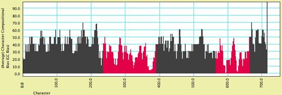
Above is an example of how the chart may appear. Some sections
of the chart are red because those characters were indicated as
belonging to a distinct character
group or partition. In this chart, the introns (marked in
red) have a stronger AT bias.
Calculation and Formatting options
The following menu items can be found in the Histogram menu:
- Orientation
- Number of Items (Y) by Values (X) —
This is the typical "histogram" where the vertical
axis shows how many items have the various values arrayed
along the X axis. Thus, the X axis represents the value, the
Y axis the number of items.
- Value (Y) by Items (X) — This displays
the data with items arrayed in sequence along the X axis,
and the Y axis representing the value for each item. This
may be appropriate for items, like characters (sites in a
DNA sequence), which have a natural ordering to them.
- Grouping on X — The X axis may be grouped
into categories, such that the values falling within a range
on the X axis are summarized in a single bar. This submenu controls
any grouping.
- Automatic — Mesquite chooses automatically
how to group on the X axis
- No grouping — The X axis is not
grouped, and thus each item or object (each character, tree,
etc.) is represented by a separate bar.
- Fixed number of groups — The X
axis is divided into a specified number of groups.
- Fixed Group width — The X axis
is divided into groups of a chosen width.
- Moving Window — The X axis is
divided into overlapping groups of a chosen width. This
serves to smooth the chart by averaging over adjacent values.
There are two parameters to set: the width of the moving
window, and its increment. The increment is the offset between
the starting edge of adjacent moving window positions.
- Analysis — In this submenu could be
various analytical tools. Two standard choices are Display Mean
and Percentiles..., which display the mean value and tails of
the distribution.
- Show Average For Group — When the chart
is in the orientation Values by Items, and there is grouping
along the X axis, then each bar may represent several objects
(characters, etc.). This menu item allows you to choose whether
the Y axis should show the sum of the values of those objects,
or their average value.
- Show Individual Points in Text — When
the chart has grouping along the X axis, then the text view
of the window by default hows sums or averages of the groups.
If instead you want the text view to give all of the values
for the original objects shown by the chart, then select this
menu item.
Scattergrams
The scattergrams available in the Analysis menu are:
- Characters — each point in the plot
represents a character. These could be all of the characters
of a matrix, or a series of simulated or randomized characters.
- Taxa — each point in the plot represents
a taxon within a taxa block.
- Trees — each point in the plot represents
a tree. These could be all of the trees within a tree block,
or a series of simulated or randomized trees.
- Nodes (Available under New Chart for Tree
when a tree window is foremost) — each point in the plot
represents a node in the tree of the tree window.
These scattergrams show the values of two variables for the objects
of concern. For some scattergrams, a choice is given as to whether
the Same or Different calculations
should be shown on the two axes. By "Same" is meant
that the same calculation is done but with a different parameter
value. For instance, if the scattegram is a Taxa scattergram,
it could show the character state in continuous character 1 on
the Y axis, and the state in character 2 on the X axis. These
represent the same calculation (continuous character state value),
differing only in the character used. By "Different"
is meant an entirely different calculation, such as the asymmetry
of a tree on the Y axis and its likelihood score for a character
on the X axis.
Examples
Canonical Variates Analysis
— For a sample of specimens measured for a series of variables,
how can the measurements be combined to best distinguish predefined
groups? Multivariate analyses such as these can be done using
modules in the Rhetenor package. Each specimen will be treated
as a taxon. A continuous data matrix of the measurements should
first be entered, and the taxa be assigned to groups.
Next:
- Select Analysis>New
Scattergram For>Taxa
- In response to the query about same or different calculations,
chose Same
- If asked, indicate you want to value for taxa to be Continuous
States of Taxon. Otherwise, in response to the dialog
box "Source of characters (for Continuous States of Taxon)",
ask to show secondary choices and choose "Characters
from Ordinations".
- In the dialog box "Source of matrices to be ordinated",
select Stored Matrices.
- In the dialog box "Ordination (for Characer Source)",
select Canonical Variates Analysis. (You may
need to ask for secondary choices)
Correlation between variability
and hydrophobicity — Do amino acid positions in
proteins tend to evolve more quickly or more slowly depending
on how hydrophobic they typically are? Mesquite does not yet have
direct way to estimate rate for protein characters, but we can
approximately compare relative rates by comparing the number of
parsimony steps for characters on a tree. First, begin with a
file containing a protein data matrix and an open tree window
showing a tree. Next:
- Select Analysis>New
Scattergram For>Characters
- In the dialog box "Source of characters (For Characters
scattergram)" choose Stored Characters.
- In response to the query about same or different calculations,
chose Different
- On the X axis we will put hydrophobicity. Thus, in the dialog
box "Values for X axis", ask for secondary choices
and choose Protein Site Property.
- In the dialog box "Property of Amino Acid" choose
Kyte & Doolittle Hydrophobicity.
- In the dialog box "Values for Y axis", choose Character
Value with Current Tree. In the dialog box "Value
to calculate for character" chose Parsimony Character
Steps. Indicate you want Current Parsimony
Models to be used in the parsimony calculations.
The following scattergram shows the results of such an analysis,
with two additions. First, the dots are colored by a third variable,
the mean molecular weight of amino acids at that site. This can
be done by selecting Color by Third Value from the Color menu,
and in the dialog box "Values by which to color spots in the scattergram"
asking for secondary choices.
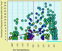
Second, the analysis assistant Scattergram Regression Diagnostics
(part of the PDAP
package) is in use, and shows the regression line. The text view
of the window shows the details of the analysis. The correlation
is highly significant.
Calculating and formatting options
The following menu items can be found in the Scattergram menu:
- Marker Size — allows you to choose
the size of the dots of the scatterplot
- Analysis — In this submenu could be
various analytical tools. For instance, if PDAP
is installed, you can request regression and correlation analysis
under Scattergram>Analysis>Other Choices.
- Special Effects
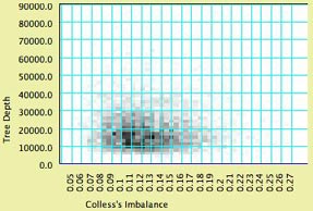
- Show Density — this shades the
background of the chart according to the density of points.
To see this, you may want to turn off "Show dots"
(see below). Here is an example:
- Join the Dots, Join Last to First, Thick Joints
— These control whether and how a line is drawn between
dots of the scattergram. These options are used to indicate
molecular structure as in the cytochrome B example in Mesquite_Folder/examples/Molecular/06-cytochromeB.nex
- Show dots — determines whether or
not the dots representing objects in the scatterplot are drawn
individually
In addition, if the scattergram is of characters, a Color
menu will appear that allows you to color the dots according to
a third value of the characters.