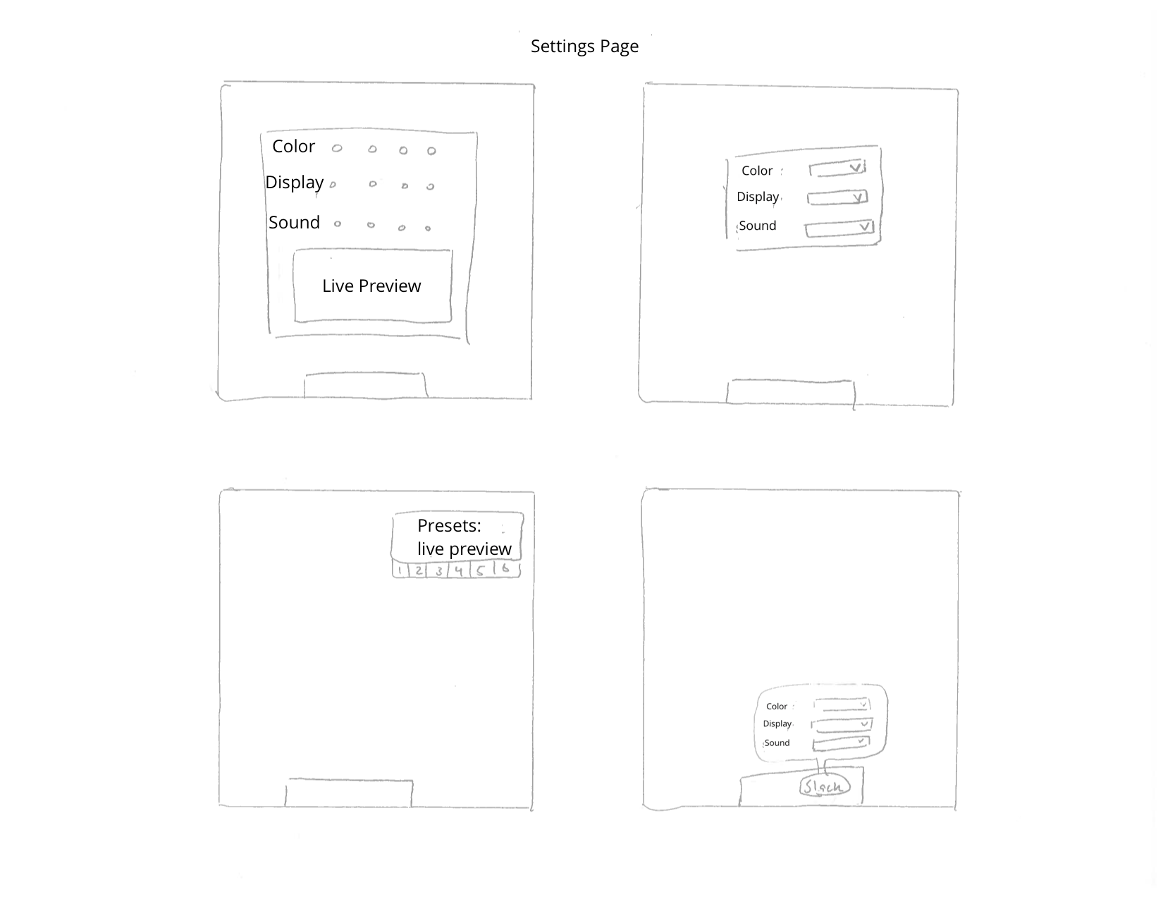
Sketches for the Settings Screen
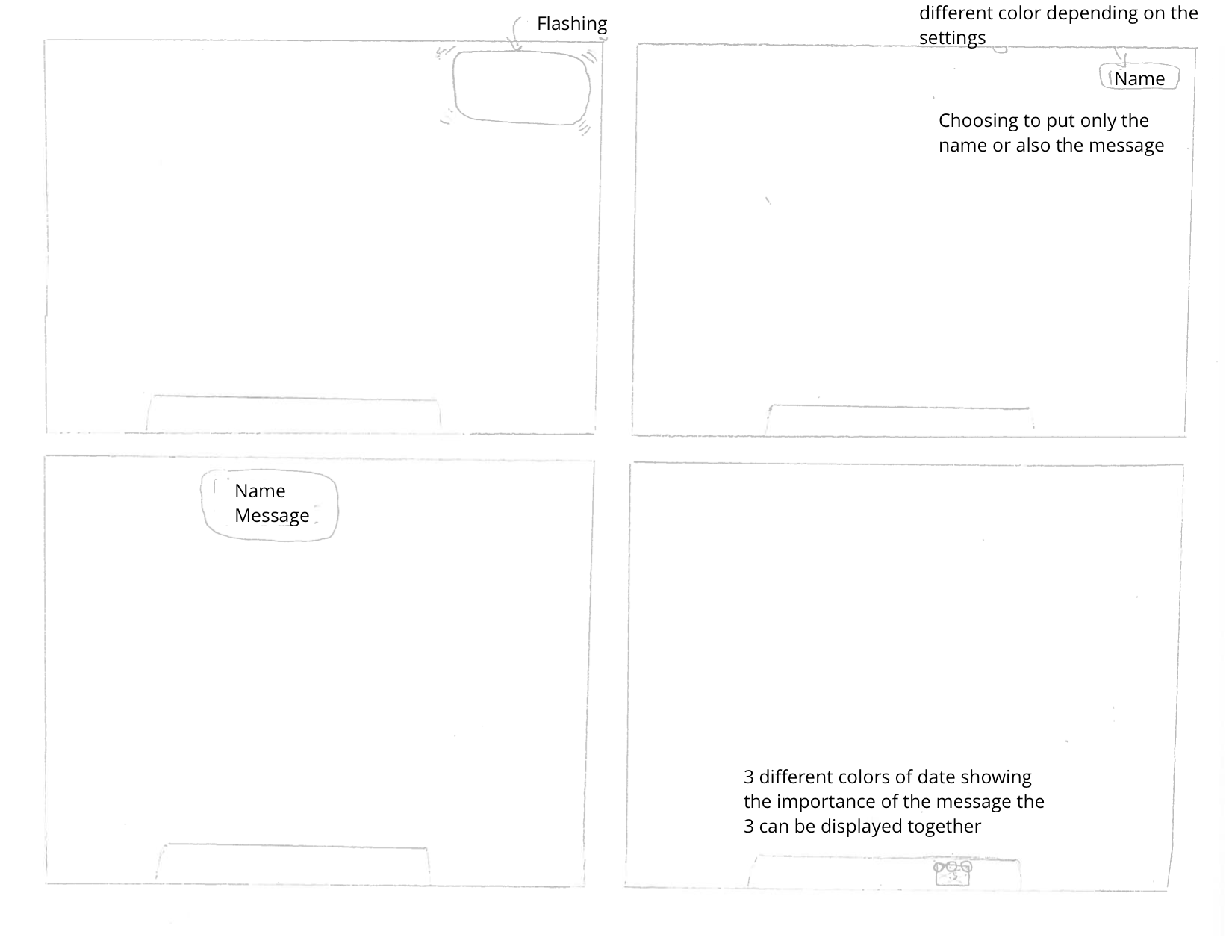
Sketches for the Notifications
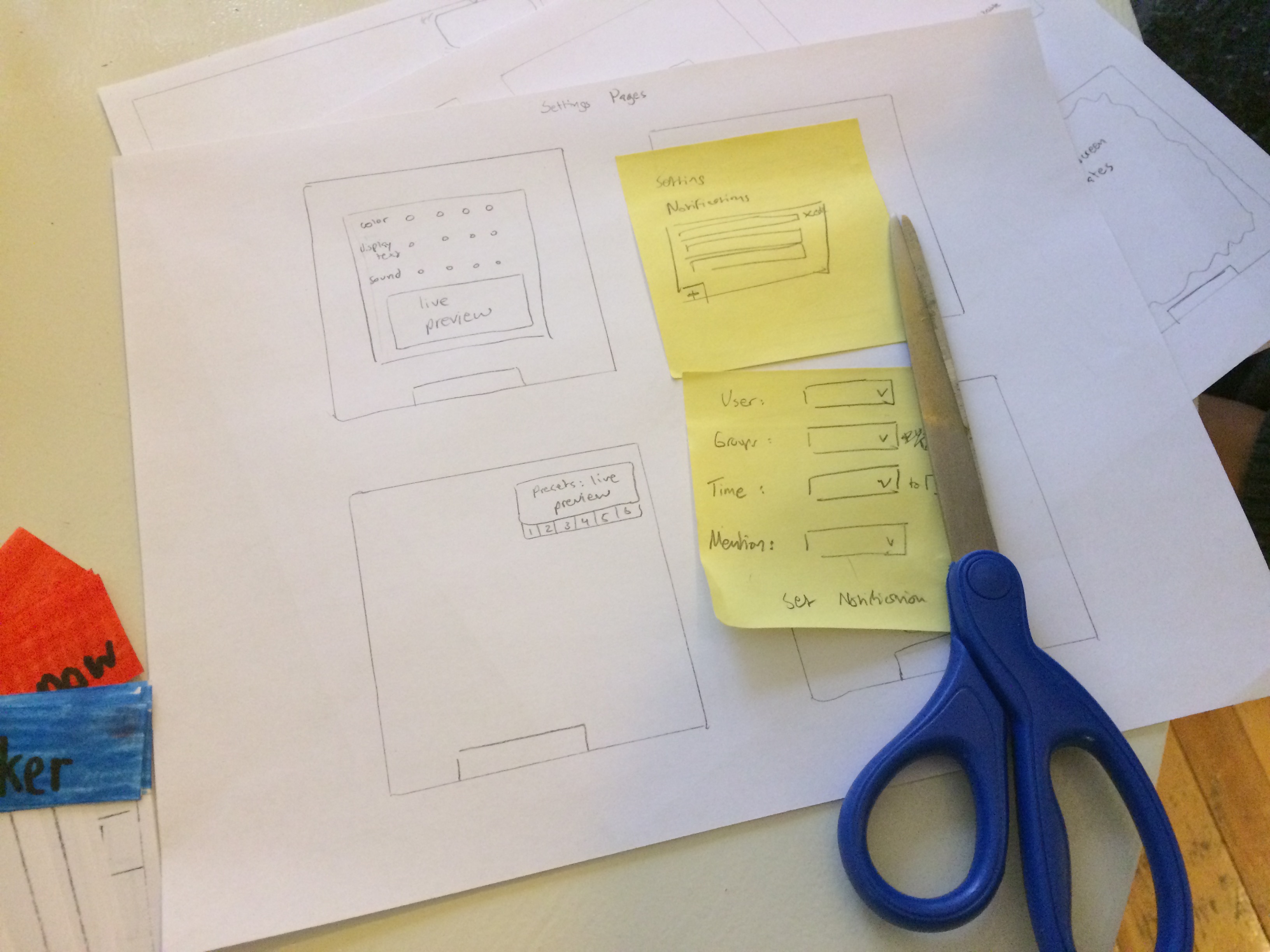
Working off of Sketches to create Prototypes
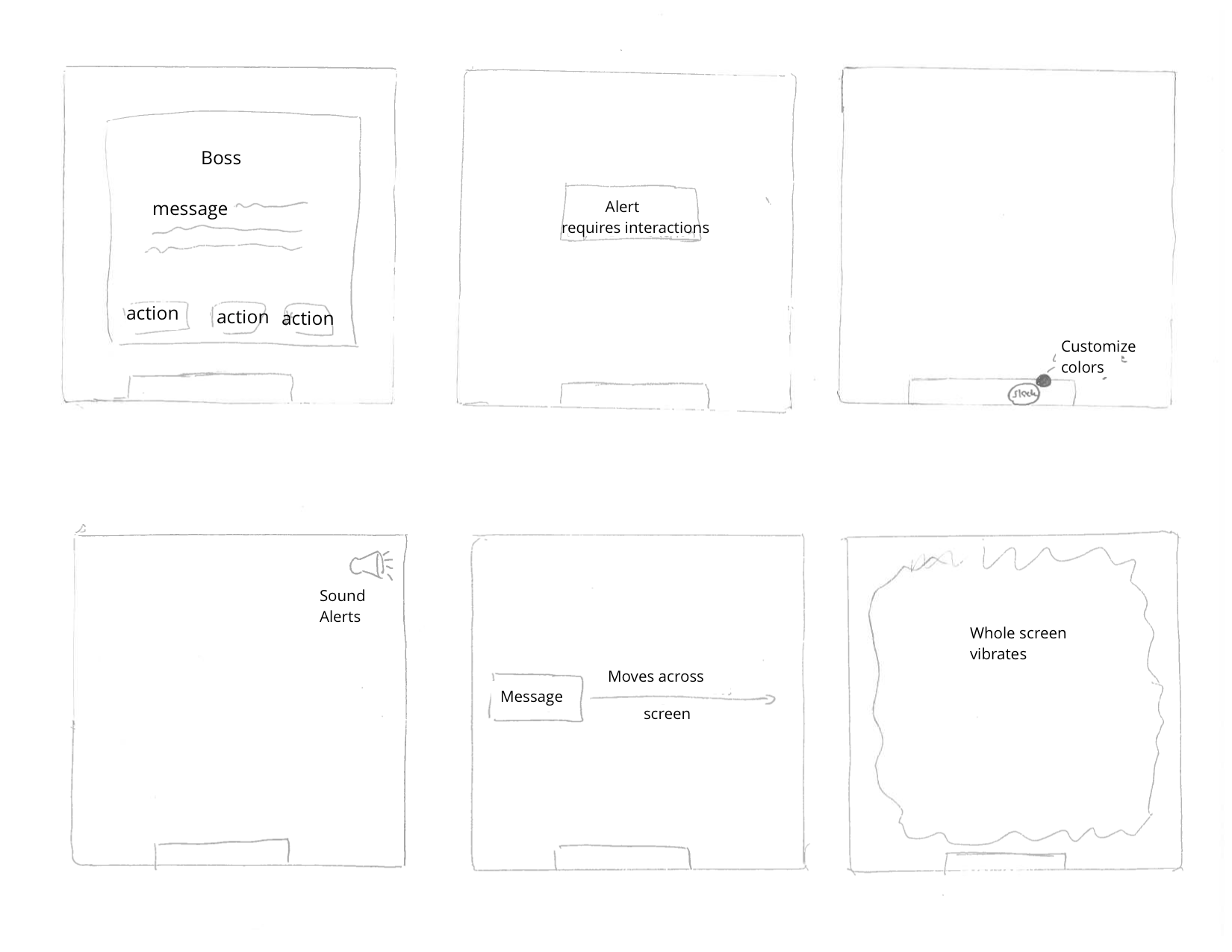
For each of the prototypes, the user may select with their index finger, the notification, itself (if visible) or the slack app in the dock to open the Slack application and respond to the notification. The user may decide to read the notification and do nothing. Here are the prototypes we developed when narrowing down our design sketches:
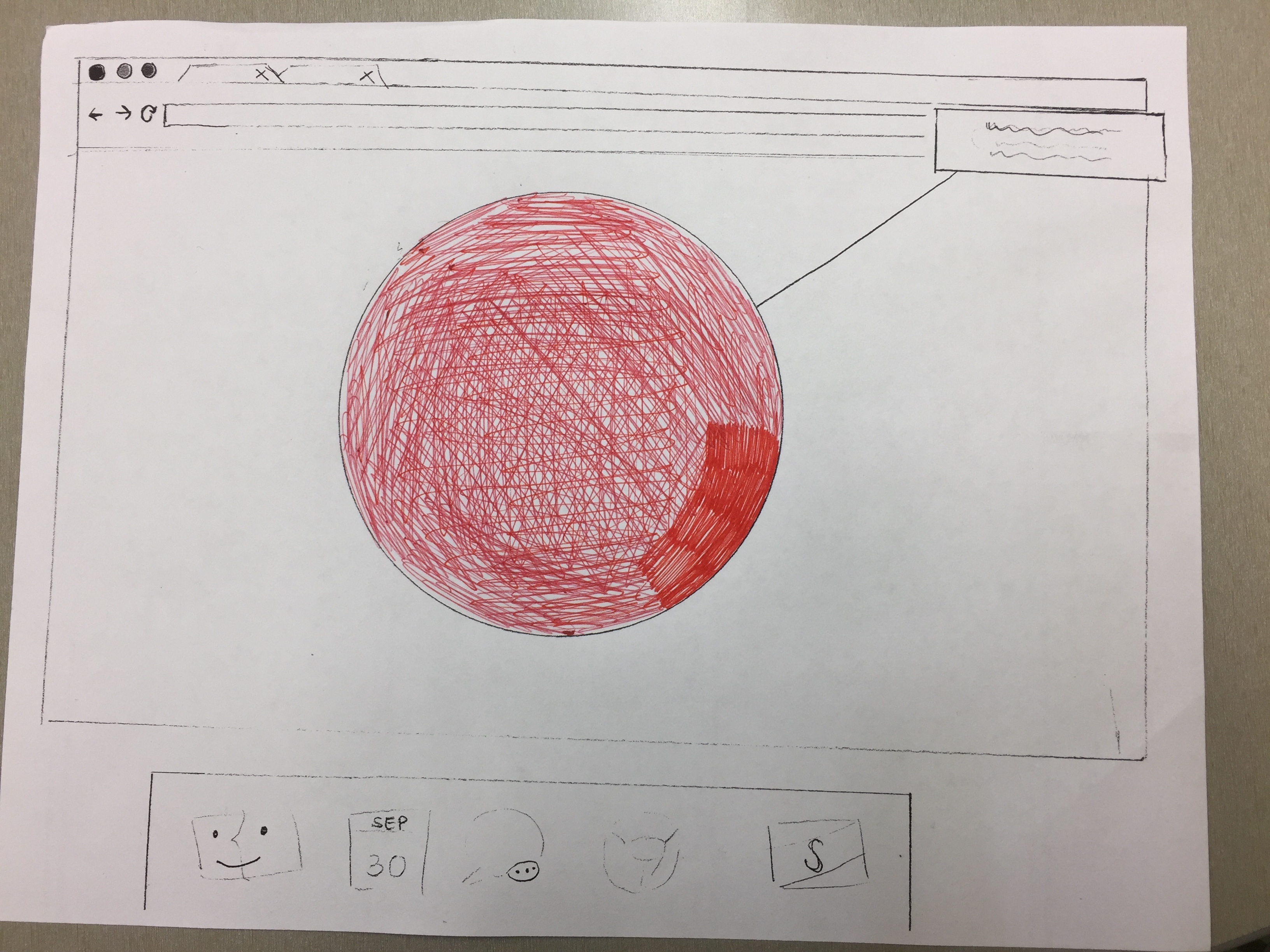
Figures 1:
These prototypes show a big center circle with distinct colors meants to grab attention and ensure the user sees the notification.

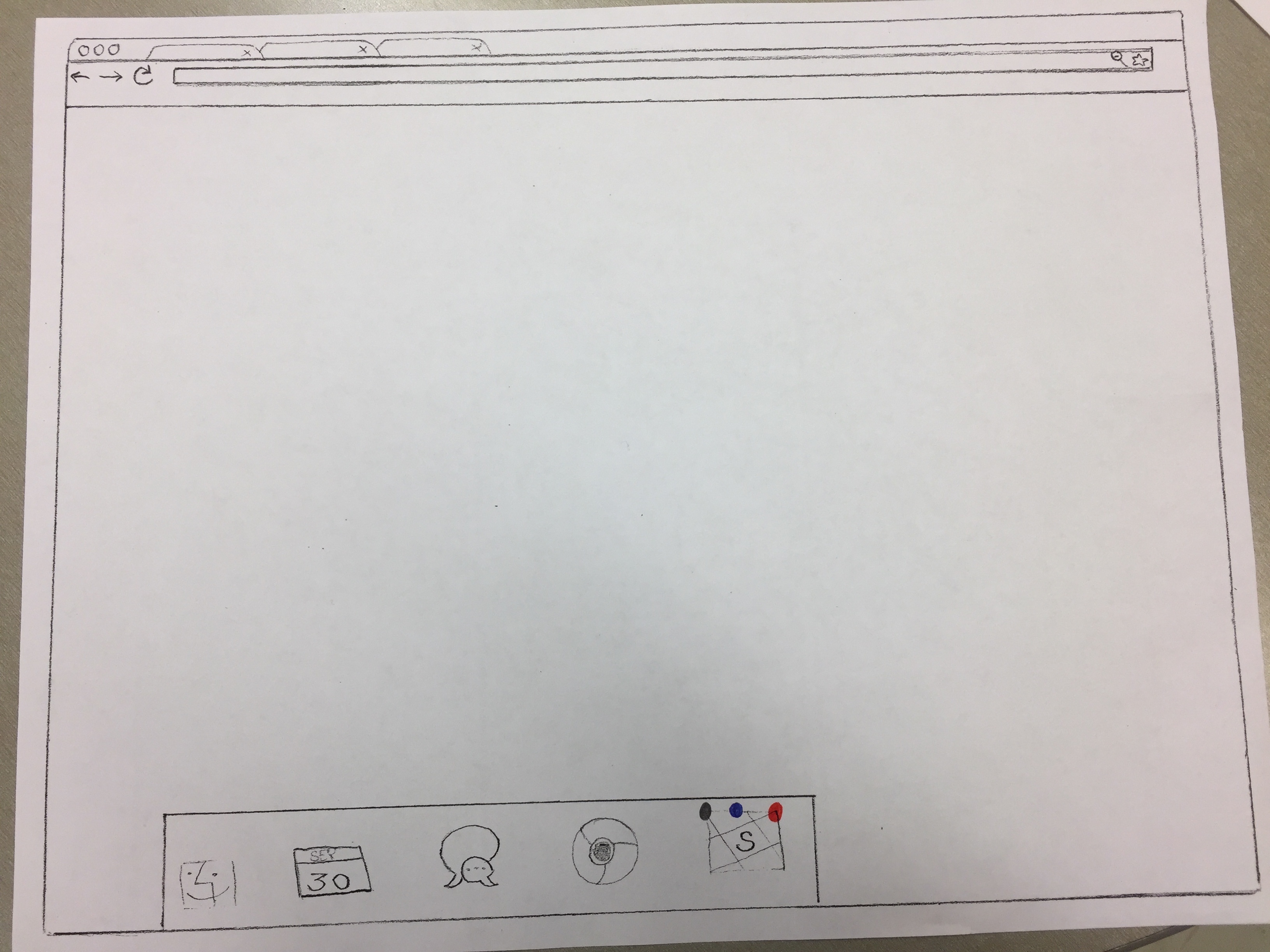
Figures 2:
These prototypes show a dot appearing on the slack icon on the dock, where the color of the dot is changing with the importance of the message. If there are several messages of different importances, the color of the more important message will be the one on the desktop app.
Figures 3:
This prototype works by displaying a few different styles of rectangles on the upper right hand corner of the screen.
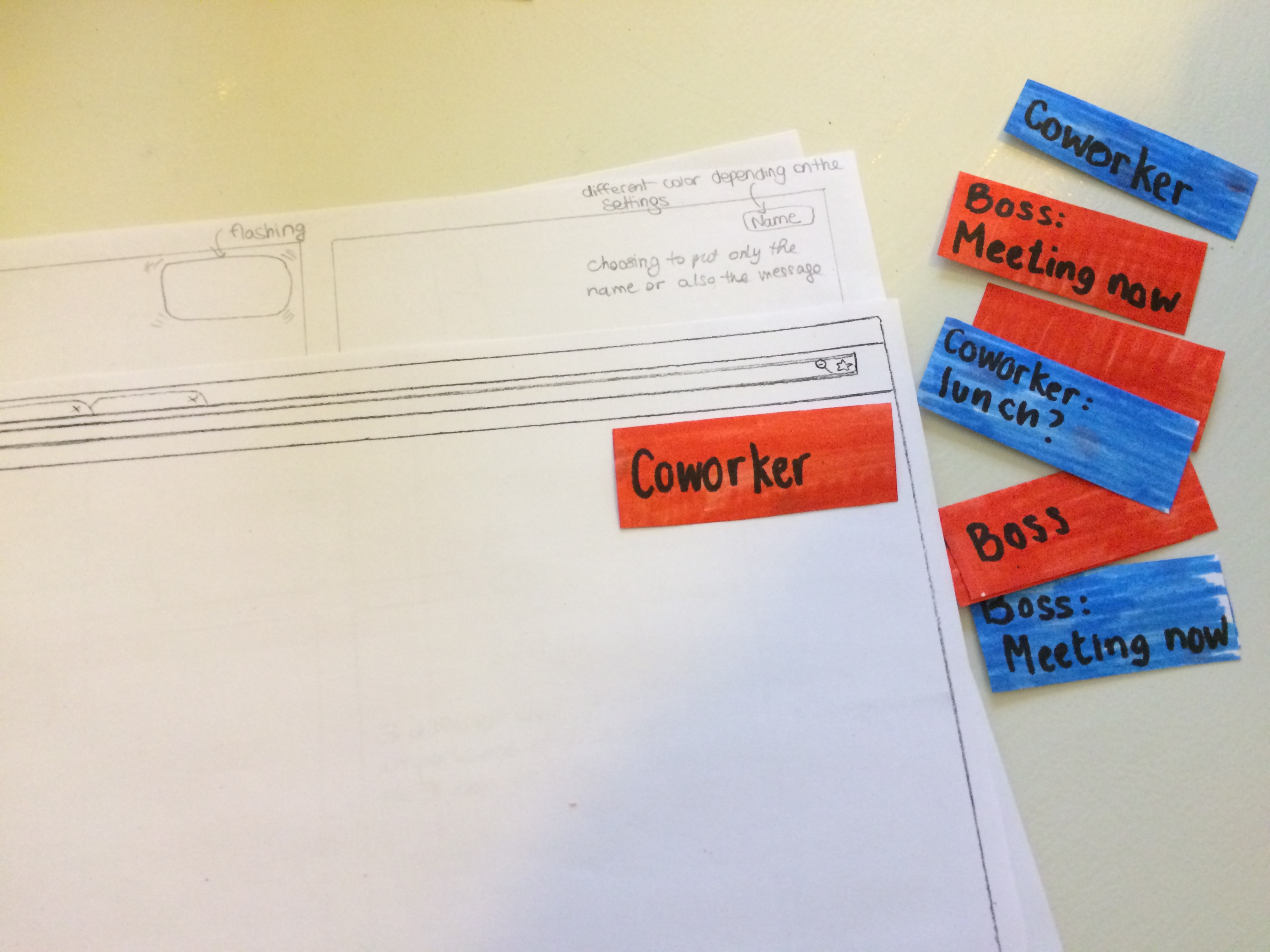
Figure 4:
One prototype is simply just sound being played as the notification medium with different sounds indicating different priority.
high priority notification
low priority notification
Goal: The system should effectively indicate notification priority Task: The user will be able to determine whether a message is important or not Explanation: If the user is unable to determine message priority from the notifications, the system has failed to properly meet the user's needs. The system is designed to facilitate parsing through messages received on slack, if the user cannot distinguish between messages they assign higher priorities to then the system does not function as intended.
Goal: The system should be easily comprehensible
Task: The user will be able to set up notifications without difficulty
Explanation: The system is intended to help the user in dealing with notifications and messages, facilitating communications through slack. If the system is unclear then the benefit of notification is negated by frustration in understanding the system.
Goal: The system should save the user time
Task: The user will be able to focus and prioritize tasks better
Explanation: Using our system should better help the user manage whether or not to spend effort and time responding or checking slack. In addition the user should be able to respond and deal with important messages in a more timely manner.
Goal: The system should be highly customizable
Task: The user will be able to distinguish enough between several notifications schemes
Explanation: If the user has several groups and or channels they participate in, the system should be customizable enough that the user can easily distinguish between several different notification settings.
Goal: The system should be used and adopted
Task: The user should interact with the system during use and have a desire to continue using the system
Explanation: If the system is present but not interacted with during use then it provides little to no purpose. In addition if there is no desire to use the system later on then there is no reason for the system to exist.
| Benchmark Task | Definition of success | Test results (video citations - see below) | Success? |
|---|---|---|---|
| The user will be able to determine whether a message is important or not | User successfully distinguishes between high and low priority by either clicking or ignoring messages |
|
Overall yes, the user understood the difference between a high and low priority message |
| The user will be able to set up notifications without difficulty | User successfully adds or edits a notification in the setting page |
|
Yes, given a bit of guidance all users managed to reach the end |
| The user will be able to focus and prioritize tasks better | During high priority tasks, low priority messages are ignored and vice versa |
|
Yes, there was a distinct correlation between users ignoring low priority messages during high priority tasks and vice versa |
| The user will be able to distinguish enough between several notifications schemes | Can the user keep track of the color and sounds specific to each notification |
|
No, even with the limited combinations of notifications we permitted, users had difficulty distinguishing between several notifications |
| The user should interact with the system during use and have a desire to continue using the system | User actively engages in interacting with notifications and responded that they would use system |
|
Not really, most users expressed that they did not benefit from the system or could not see themselves benefiting |
Separate Comments: We included this video with participant commentary to highlight his point that his reaction to notifications will also be different depending on the type of activity he is doing (not just if it is a high or low priority activity). We believe this shows that the reaction can be different for different notification from the same priority level (a friend or a coworker).
When receiving several messages from the same person in a small time lapse, if the user was too busy when he received the first message from this person, he will quickly click on the second message from this person as the fact of receiving several messages in a small time lapse may mean that it is important.
Description: In this video, the user is confused about the sounds : at first, he does not know what the sounds are and when he remembers that he is receiving a message when there is a sound, he just clicks on the app for every sound. Finally, when he remembers that the different sounds are for different types of messages, he tries to just click on the one that are related to one sound and not to both.
Description: In this video, the user is clicking on every message and not making any difference between low and high priority messages while doing a high priority task.
Description: In this video, the user is doing a low priority task and stops his activity when he is receiving a high priority message.
"Definitely need to have both the sound and (name and message) to be the most useful, if I can get rid of most Slack notifications through this (almost like Inbox for Gmail) I can see myself using this as the default Slack notification conduit"
We included this excerpt since it was helpful feedback in user adoption of the system.
The main issue we noticed was that more guidance and explanation should be given to facilitate understanding of the product and system we are implementing. In some of the users it required some time before they developed an understanding of how the system worked and how to interact with this. However the way the notifications were presented was understood and interacted with properly by all participants. The only instance where this was not the case was during a test where only sound was played to indicate the received notification and a user was not sure how to proceed, where all other users clicked on the slack app on the dock. In addition one complaint was that all users thought that just the color or sound was not sufficient for distinguishing purposes and more information was required, this would eliminate several of our prototypes.
We believe this will be clearer with a computer prototype. In addition we believe that the setting page was intuitive (familiar) enough given that the user understands what it is for. In one occasion the user was stuck on the setting page, where we provided a short explanation of what he was supposed to be doing, whereupon he immediately grasped the goal and was able to navigate through to the end effortlessly.