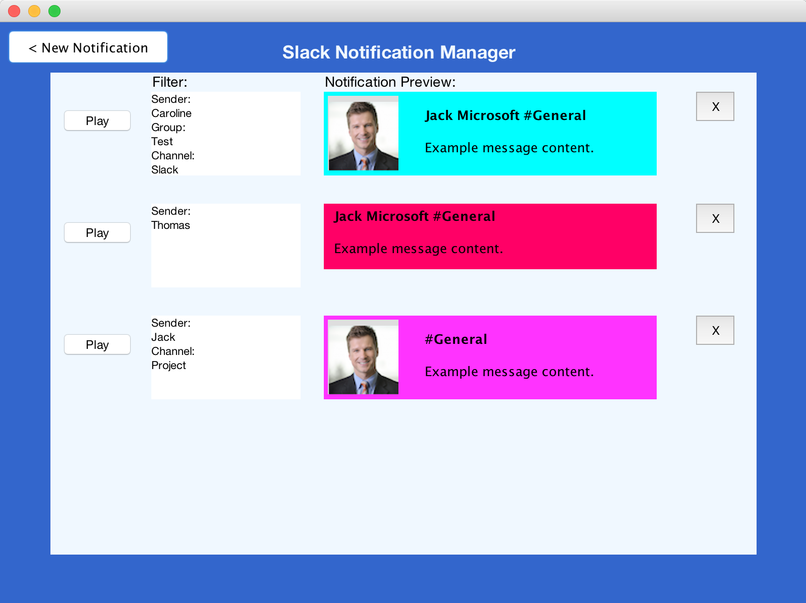
Figure 1. Beta System Notification Manager
Over the past few weeks we have iterated through a multitude of potential design implementations based on the insightful feedback provided by the Evaluation team through the Formative Feedback stage, peer feedback from our alpha prototype, and our own thoughts. In the development of the Beta System, we continued to encounter a few technical challenges, the largest being accessing Slack's outgoing messages in real time. So we decided to continue and focus on the highly interactive experience of setting, viewing, and managing the notifications. We also believe focusing on developing the design aspects is more related to HCI.
We have tied the settings page directly to the notification system. We then let the user customize the notification and send themselves a test notification. In addition the user is now able to manage the notifications they have set in a new Notification manager page. We have not connected the notifications to Slack, nor do we have an automated system to send out the notifications at certain intervals, so we ask that the user interpret how our system would functions given real-world situations. In addition we ask the evaluators to focus on the actual design of the notifications, the settings page, and how the notifications are presented - the real focus of HCI. The significant changes are highlighted below.
Visibility of the system status
Priority:
High
Solutions:
This was a problem that we, as the design team, came up with. While our prototype succeeded in creating and setting notifications, for proper full functionality there was a need for a manager. This would enable the user to view all the different notifications that they created, decide to edit or delete them, amongst other actions. This would bring our solution full circle in terms of a complete packaged application. In addition it helps in satisfying the heuristic of "visibility of system status", by providing the users all the information about set notification criteria all on one page, where previously they could only set the notifications but not manage/view them.
Figure 1. Beta System Notification Manager
Error Feedback
Priority:
High
Evidence:
"We believe that you should not be able to delete the notification just by clicking on the 'x' this does not prevent the user from making a mistake and they would they need to recreate the entire notification." - Hi-Fi Prototype Feedback
"The delete button should be made more conspicuous in the settings page. This should prevent users from accidentally clicking the delete button, as was seen in testing (a subject didn't notice the delete button until after he had accidentally clicked it)." - Formative Feedback
"Testing suggested that it is too easy for users to delete settings in the notification settings page. This could be particularly annoying if a setting is deleted that has been applied to several channels, people, or groups, as mentioned in the "Analysis". We suggest implementing a prompt that warns the user when they are about to delete a setting IF it has been applied to one or more channels, people, or groups." - Formative Feedback
Solution:
With feedback from the heuristic evaluations performed, in addition to some user comments we received during additional testing, we decided to implement several error dialogs to prevent errors. We implemented error prevention in the Notifications Settings Page as well as the Notification Manager. In the Settings page, we ensure that the user selects at least one filter and they input actual text for each filter they select. If no text is detected by the program then an error message pops up and the user is prompted to input text again.
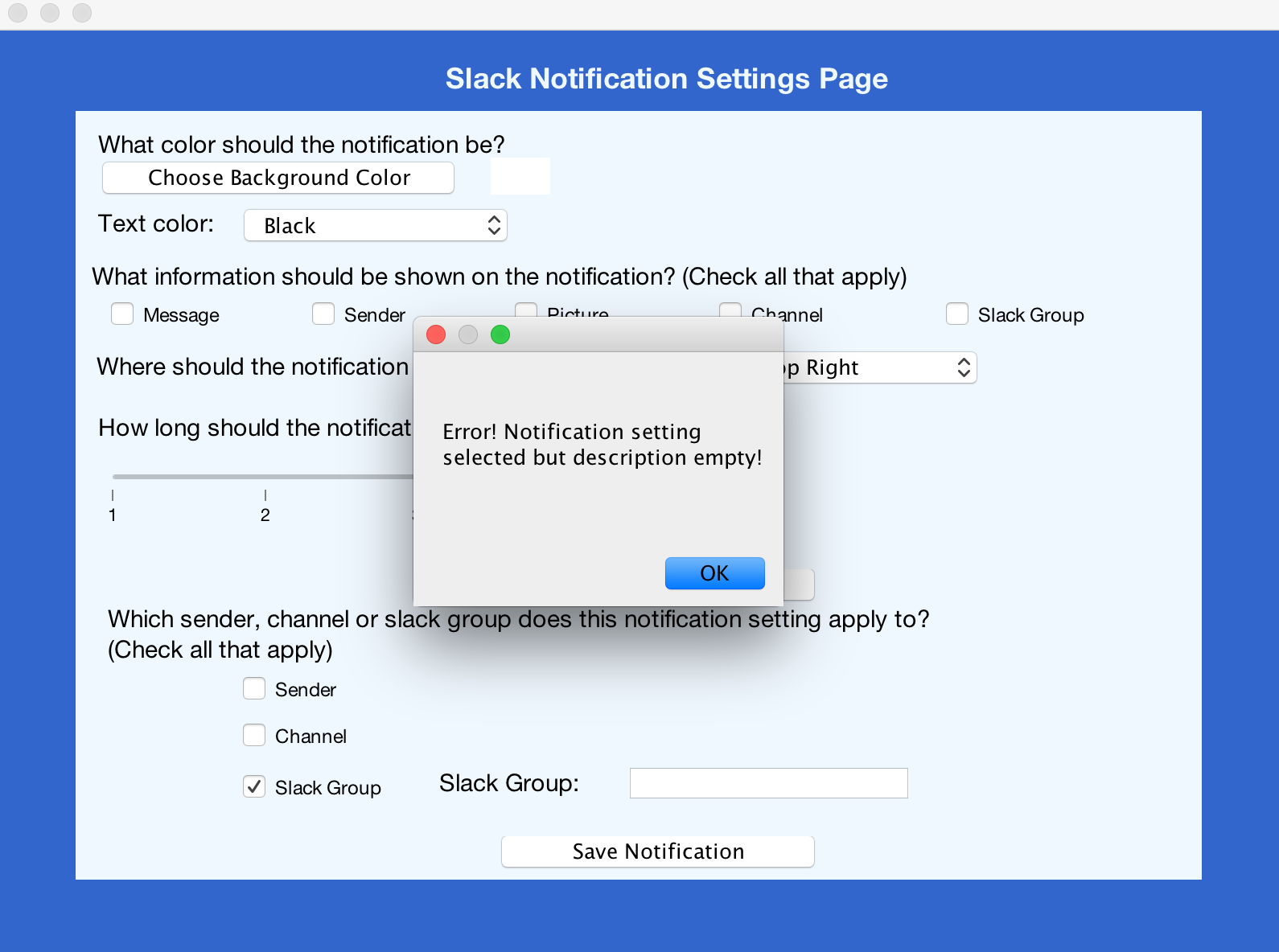
Figure 2. Error Prevention: Filter Description Empty
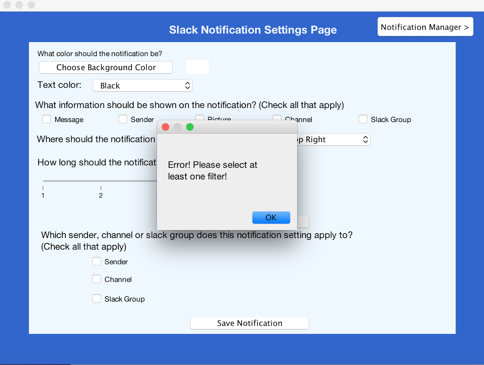
Figure 3. Error Prevention: At least one filter must be chosen
In addition in the Notification Manager page we have implemented a popup to ensure that the user wants to delete a notification when clicking on the 'x', this comes directly from feedback of the computer prototype. Both of these changes go with Nielsens Heuristic of "Help users recognize, diagnose, and recover from errors" and "Error Prevention".
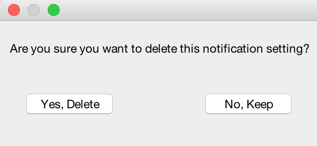
Figure 4. Error Prevention: Delete Notification Dialog
Freedom of choice
Priority:
High
Solution:
To give the users even more freedom of choice and provide a more intuitive interface for the notification manager we implemented several pages. These pages provide the ability to set up to 8 notifications, ultimately linking to our Usability Goal #4 : "The system should be highly customizable" and Nielsen's Heuristic "User control and freedom". There are a total of 8 notifications that can be stored based on Miller's law of 7 plus or minus 2.
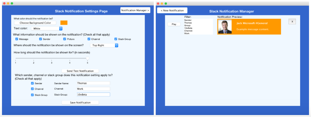
Figure 5. Multiple pages in Manager
Mapping between notification setting and filters
Priority:
Medium
Evidence:
"The mapping between notification settings and the actual notifications should be clearer. Users should understand what the notification settings are for when looking at the page. We suggest showing which channels/groups/people each notification setting has been applied to beneath each notification setting." - Formative Feedback
"It may also be desirable to be able to apply a notification setting to a particular channel/group/person from within the notification settings menu." - Formative Feedback
Solution:
We added a new section to the Settings page as highlighted by Figure 6. When the user has chosen the type of notification he wants, he can now choose for which notification to apply it to. The sender, channel or slack group can be chosen to filter out the notification. This is linked to Nielsen's Heuristic "User control and freedom"and "Flexibility and efficiency of use".
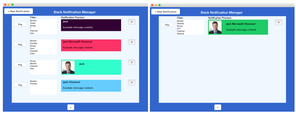
Figure 6. Filters from Settings Page map to filters on Slack Notification Manager
Exclusion of Sound in Notifications
Priority:
Low
Evidence:
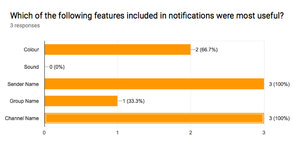
Figure 7. Results from the Post-Test Questionnaire during Formative Feedback
"Subjects did not consider sound to be a useful feature in notifications, but this may have been because of the lack of sound in the prototype notifications." - Formative Feedback
Solution:
The sound option was not explored in this deliverable based on the User Tests conducted during the Formative Feedback, results indicated that sound was not thought to be very useful.
To access our prototype we ask that you download the jar file found here. Then if you could take a look at our user manual in the section below you should be up and running in minutes. We hope you enjoy the prototype.
Beta SystemWe refined our User Manual to take into all the specific changes mentioned above in the Design Evolution section. This includes going through the new possible flows, and describing all the new interactions available to the user. Here we hope that readers get a great understanding of our system and its capabilities, and can get it up and running in minutes. The changes made moving from the Alpha System to the Beta System are highlighted in red text. Enjoy!
User Manual