Over the past few weeks we have iterated through a multitude of potential design implementations based on the insightful feedback provided by the Evaluation team through the Formative Feedback stage. In the development of the Alpha System, we encountered a few technical challenges, the largest barrier was accessing Slack's outgoing messages in real time. Instead of focusing on the technical challenge of synching our application to Slack, we decided to focus on the highly interactive experience of setting and viewing said notifications. The technical ability and time it would take to connect our application to Slack seamlessly is unfeasible given the course schedule. We have therefore decided to focus on developing the design aspects, which we believe is more related to HCI.
We have tied the settings page directly to the notification system. We then let the user customize the notification and send themselves a test notification. We have not connected the notifications to Slack, nor do we have an automated system to send out the notifications at certain intervals, so we ask that the user interpret how our system would functions given real-world situations. In addition we ask the evaluators to focus on the actual design of the notifications, the settings page, and how the notifications are presented - the real focus of HCI. The significant changes are highlighted below.
Clarity of Wording on the Settings Page
Priority:
High
Evidence:
"Lack of clarity in the settings page (high priority)" - Formative Feedback
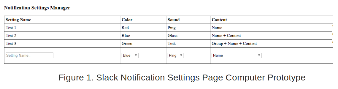
"However, the settings page doesn't clearly map to anything. We understand that this is a limitation of the prototype, but the settings page should provide users with some information regarding what is going on with them (i.e. what are the settings for). This might be done by explicitly listing what groups/channels/people the setting has been applied to. " - Formative Feedback
"Subjects had trouble figuring out what the "content" label referred to in the Notification Settings menu." - Formative Feedback
"Phrasing in the settings page could be more descriptive without being too technical." - Formative Feedback
Solutions:
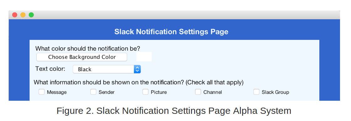
In order to solve this issue, we performed a complete revision of our settings page (see differences between Figure 1 and 2). We included detailed information on it so that the user will feel comfortable when facing different choices. We did a more question and answer style in order to clarify the different choices that the user can choose to customize their notifications. This is related to our Usability Goal #2 : "The system should be easily comprehensible".
To clarify the meaning of "content", we added the question and answer style for setting up the appearance of the notification. In Design Critique, we also received feedback on the phrasing. In an attempt to alleviate the confusion, we added specific labels that increased "Flexibility and efficiency of use" (Nielsen's Heuristic). This is also linked to our Usability Goal #2.
Lack of color variety in notification color options
Priority:
High
Evidence:
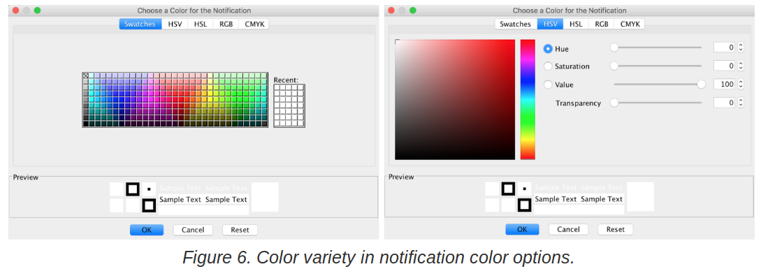
"Subjects commented on the lack of color variety in notification color options." - Formative Feedback
"Two of the users stated colour was their favourite feature as it helped to distinguish the priority of messages. " - Formative Feedback
"Two subjects stated the inclusion of colour was one of their favorite features; one subject disliked the inclusion of color." - Formative Feedback
"As stated in the usability goals, the system should be highly customisable. One subject expressed disappointment at the few color options available in the notification settings. During heuristic evaluations, evaluators thought that the red notifications may be too bright. Giving additional colour options for notifications by providing users with the ability to pick the Hue/Saturation/Value (perhaps by using a color wheel), or by providing more predefined colours can amend this issue." - Formative Feedback
Solutions:
The first critique we had on the notifications was that the system was not customizable enough . We changed the way to choose the color: instead of having a dropdown with only three colors available, there is now additional predefined colors and you have five different ways to choose your color. This is a better way to answer to our Usability Goal #4 and Nielsen's Heuristic "User control and freedom ". This change makes sense in term of usability.
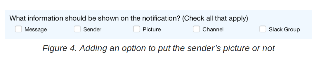
Insufficient Amount of Customization of Notifications
Priority:
Medium
Solutions:
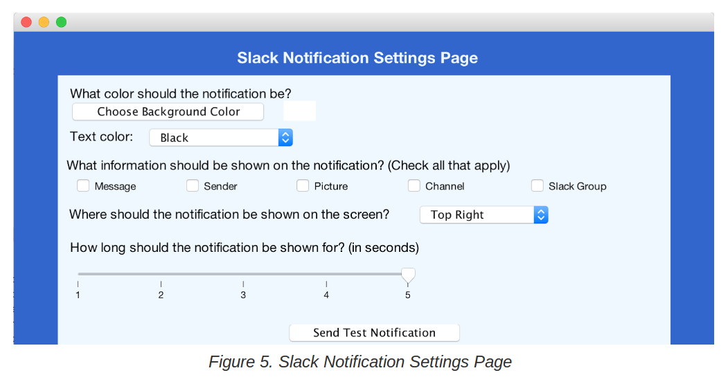
This was a problem that we, as the design team, came up with. To solve it, we increased the number of customizations : the user can now choose to display the channel or not, the text color can be changed and the position of the notification in the screen can be chosen. This is linked to our Usability Goal #4 and Nielsen's Heuristic "User control and freedom ".
Moreover, the user can now test in real time the settings they enter for their notification by clicking on "Send Test Notification". The Settings page is now linked to the display of the Notification which is also a big improvement in the system as these two parts were completely separated before. This satisfies Nielsen's Heuristic "Match between system and the real world".
Overall, a much more intuitive and clean interface was created that allows to test the settings you would like to choose.
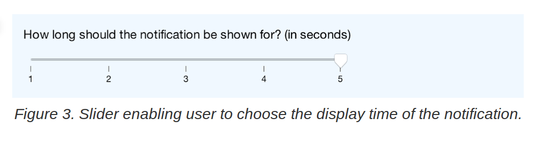
Time Duration of the Notification
Priority:
Medium
Evidence:
"Speed of the notifications disappearing was too fast (medium priority)" - Formative Feedback
"The notifications should display for slightly longer. There were complaints about the brief longevity of notifications preventing them from being readable. These complaints were most likely influenced by the rapid succession of notifications; however, a slightly longer display time would still be beneficial. We recommend finding a balance between a short enough display time so that messages are not obtrusive, but long enough so that messages can be read." - Formative Feedback
Solutions:
We added a new option to answer to that issue. The user can now choose how long he wants the notification to be displayed for. Letting the user choose the time that he wants the notification to be displayed is a good solution of the problem as it is depend on the user : some users will want to have the time to read all the message whereas for some others, just seeing one key word will be enough to know what they want to do with the message. This is linked to our Usability Goal #4 : "The system should be highly customizable"and Nielsen's Heuristic "User control and freedom ".
Inclusion of Pictures in Notifications
Priority:
Low
Evidence:
"Lack of ability to remove picture from notification (low priority)" - Formative Feedback
"Additionally, the display pictures that appear on the notifications may intrude on privacy (if the user is in a public setting) or can be annoying. We suggest an option to remove the Slack user display picture from notifications, while including it by default." - Formative Feedback
Solutions:
We also solved it by adding the possibility to choose whether or not you want a picture, choice that was not possible before. There is now more freedom in the customization as the user can choose everything that is being displayed when the notification shows up. This is linked to our Usability Goal #4 and Nielsen's Heuristic "User control and freedom ".
The Problem (from the Project Proposal):
"Slack is a messenger application. Users from the same group can message about specified topics, called channels or users can direct message another member of their group. The groups are separated into two different sections in the GUI of the application.
When the Slack window is minimized, if you receive a notification, a red dot appears on the corner of the icon (on mac in the dock). Unfortunately, the icon does not show from which group the notification originates. A common issue encountered by most users is how to distinguish between all the different channels or people that you are communicating with. As shown by the observed users, there are plenty of situations in which you would only like to be notified by certain people, or certain groups/channels. This can be extended to just having different notifications, so that you can filter your notifications and only check/open slack when a notification arises from someone you want to respond to.
The current system only lets you adjust the settings to play an unique sound indicating the group or allow a preview of the message. We believe a better system can be implemented to improve the notification system. Users should be able to customize notifications to their liking to improve the overall experience. This could involve changing the color of the notification dot based on a multitude of parameters, different sounds for groups or people, only allowing notifications at certain dates and time, and much more. With all of this functionality you would be able to tell whether or not you need to check your messages, leading to less distractions, a better interface, and higher productivity."
To access our prototype we ask that you download the jar file found here. Then if you could take a look at our user manual in the section below you should be up and running in minutes. We hope you enjoy the prototype.
Alpha PrototypeWe acknowledge that our previous user manual was poorly done and functioned more as an installation guide. With all the great feedback we received and with a new and improved prototype we decided to scrap our old user manual and start a new one from scratch. Here we hope that readers get a great understanding of our system and its capabilities, and can get it up and running in minutes. Enjoy!
User Manual