
|
 by François Labelle |

|
|
So you have n objects, and for each of them you performed m measurements, giving you n points in m dimensions. Because the measurements are not necessarily independent, the data is likely to be shaped like a galaxy, that is, the set of points almost lies in some 2D-plane. This page demonstrates how to rotate multidimensional data so that the best plane-fit is your screen. As you'll see, this can be an excellent visualization tool.
|
Introductory example: planetsIf you have only 2 measurements for your objects, then a good way to visualize the data is to plot the data in the plane, using the two measurements as axes. For instance, two important features of the planets in our solar system are:
Making the data plot will give you a nice representation with obvious properties:
Since 3D graph-paper is rather hard to find, the question is: can we still have a 2D-plot of the data such that the properties above still hold? (i.e. close points in the 2D-plot mean similar planets for all 3 features, etc.) In this particular example the answer is yes. There exists a 2D-projection that keeps 97% of the variance of the 3D-data. Below you can see the distance/diameter log-plot of the data (which contains no information on density). Click on the "rotate!" button to see the best 2D-projection: a diagram that is meaningful for distance, diameter and density.
see the data file
|
What are we doing exactly? | technical section | ||||||||||||||||||||||||
Obtaining the data
Preparing the data
Sometimes when the order of magnitude of measurement
Then the measurements are centered about their means:
If the measurements don't have the same unit, it makes sense to standardize them:
Finally, if some measurement i is considered more important, it can be weighted by an appropriate factor:
Rotating the dataWe wish to rotate the data so that it lies as flat as possible in the first 2 dimensions of the space.
v1 first, keep it fixed and then maximize v2.
If we do so, then
In general we can continue: keep the variance of the first 2 axes fixed and maximize
Computing the rotation matrix | |||||||||||||||||||||||||
Learning to use the applet
Another example: countriesHere we would like to get a 2D-diagram to classify some countries based on the following 3 features:
see the data file
Description of the appletThe applet starts by plotting the data along the first two measurements. On the right of the image, you have the following commands and displays:
Application to image analysis
Image processingIn satellite imaging, it's easy to get overwhelmed by measurements by imaging at various wavelengths and by repeating the measurements in different conditions. Principal components analysis can be used to reduce the dimensionality of the data to 3 (to get a red-green-blue image), or to analyze subtle variations by displaying less important components. The setup is:
Here are some links:
Image classificationA different situation is when you have many images and want to classify them. The brute-force approach is to declare that every pixel is a measurement. Principal components analysis will be useful in cases where similarity can be measured pixel-wise. Such a case is face recognition when the images are controlled (same size, same orientation, same lighting conditions). The setup is:
Here are some links:
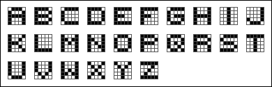
Example: the letters of the alphabet
To demonstrate image classification, we will use something simpler. All 26 letters of the alphabet have an acceptable representation on a
see the data file
A and R. It's also fun to see pairs that are far apart: H and I cannot be confused, neither can X and O (hence their use in the tic-tac-toe game).In this application, the principal components can be viewed as filters that are applied to the bitmap to extract a feature. Below are images of some of the filters. White is neutral, blue means a positive contribution and red means a negative contribution.
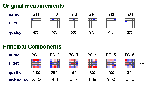
Permuting the roles of objects and measurementsWhat happens if we make a mistake and enter the objects as columns instead of as rows? This "mistake" is actually quite an interesting thing to do. Now we have one point per measurement, and we're trying to map the measurements to find out which ones are positively correlated (are giving similar values when applied to our set of objects).
If making a measurement is expensive, then this trick can be used to spot and eliminate redundant measurements. This is a broad topic and you may want to see this page on Here's the same data on letters of the alphabet, but with objects and measurements permuted. Click on the "rotate!" button!
see the data file
a12 and a14 (they overlap), and indeed, a12 == a14 for every letter.
The two furthest points on the best-fit-plot are
|
| This page is presented to Godfried Toussaint as a Web project for the Pattern Recognition course 308-644B. Other student projects can be found here. |
|
page created: May 6, 1998 last updated: June 7, 2014 |